
Innovative Web Design & Tech Solutions | Abstractech
Abstractech offers tailored tech solutions including web design, graphic design, and custom web applications to elevate your online presence and drive business growth. Join us for reliable and user...
Abstractech
7/20/20244 min read
Adopt a Mobile-First Approach
Designing with mobile users in mind from the outset ensures a seamless experience across all devices. A mobile-first approach prioritizes essential features and content for smaller screens before scaling up for desktops.
Simplified Layouts: Start with a clean and straightforward layout. Prioritize essential content and features, avoiding clutter that can overwhelm mobile users.
Touch-Friendly Design: Ensure buttons and links are large enough for users to tap easily. Maintain sufficient spacing between interactive elements to prevent accidental clicks.
Optimize Load Times
Mobile users often have slower internet connections compared to desktop users. Optimizing your website's load times is critical for keeping visitors engaged and reducing bounce rates.
- Image Optimization: Compress images without sacrificing quality. Use modern formats like WebP to reduce file sizes further.
- Minimize HTTP Requests: Reduce the number of elements on your page that require HTTP requests, such as scripts, images, and stylesheets. Combining files and using CSS sprites can help.
- Enable Browser Caching: Implement caching to store frequently accessed resources on users' devices, reducing load times for subsequent visits.
In today's fast-paced digital world, mobile devices account for a significant portion of web traffic. As a result, optimizing web design for mobile devices is no longer optional—it's essential. A mobile-friendly website enhances user experience, boosts engagement, and improves search engine rankings. Let's explore the best practices for optimizing web design for mobile devices in 2024.
Test Across Devices
With the plethora of devices available, it's essential to test your website on multiple devices and screen sizes to ensure a consistent experience.
- Cross-Browser Testing: Ensure your website functions correctly on different browsers and versions. Tools like Browser Stack can help with this.
- Emulators and Real Devices: Use both emulators and real devices to test your design. Emulators are useful for quick checks, but real devices provide a more accurate representation of user experience.
- User Testing: Gather feedback from real users to identify pain points and areas for improvement. This can provide valuable insights into how your website performs in real-world scenarios.
Final Thoughts
Optimizing web design for mobile devices is an ongoing process that requires continuous attention to detail and user feedback. By adopting a mobile-first approach, implementing responsive design, optimizing load times, improving navigation, and ensuring touchscreen compatibility, you can create a seamless and engaging experience for your mobile users.
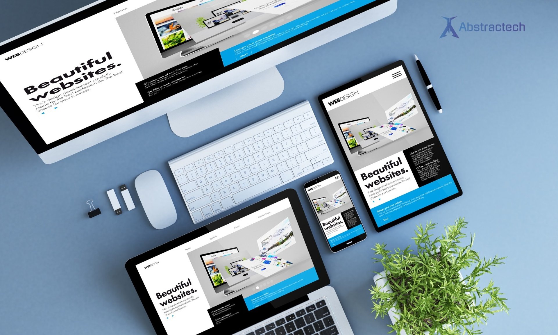
Responsive Web Design
Responsive web design (RWD) is crucial for delivering a consistent user experience across different screen sizes. This approach uses flexible layouts, images, and CSS media queries to adapt the design based on the device's screen size.
- Fluid Grids: Use relative units like percentages instead of fixed units like pixels to create a flexible grid layout that adjusts to different screen sizes.
- Flexible Images: Ensure images scale appropriately by using CSS to set maximum widths. This prevents images from exceeding the screen width and maintains their aspect ratio.
Adopt a Mobile-First Approach
Designing with mobile users in mind from the outset ensures a seamless experience across all devices. A mobile-first approach prioritizes essential features and content for smaller screens before scaling up for desktops.
Simplified Layouts: Start with a clean and straightforward layout. Prioritize essential content and features, avoiding clutter that can overwhelm mobile users.
Touch-Friendly Design: Ensure buttons and links are large enough for users to tap easily. Maintain sufficient spacing between interactive elements to prevent accidental clicks.
Typography and Readability
Reading on a mobile device can be challenging due to smaller screens. Ensuring your text is legible and easy to read is crucial for user engagement.
- Font Size: Use a base font size of at least 16px for body text. Adjust line height and spacing to improve readability.
- Contrast: Ensure sufficient contrast between text and background colors to enhance readability, especially in varying lighting conditions.
- Avoid Long Blocks of Text: Break up text into smaller paragraphs and use bullet points or lists to make content more digestible.
Touchscreen Optimization
Designing for touchscreens involves more than just making elements tappable. It's about creating a seamless and intuitive interaction experience.
- Larger Touch Targets: Make sure buttons and links are large enough for users to tap comfortably with their fingers. The recommended size is at least 44x44 pixels.
- Gestures: Incorporate common touch gestures like swiping, pinching, and scrolling to enhance usability. Ensure these gestures are intuitive and consistent with user expectations.
- Feedback: Provide immediate visual feedback when users interact with elements. This helps users understand that their actions have been recognized.
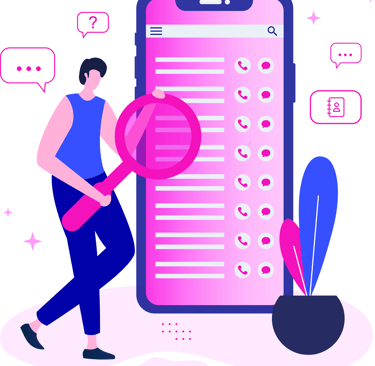
Improve Navigation
Easy and intuitive navigation is essential for mobile users, who often interact with websites on the go. Streamlined navigation enhances the user experience and helps visitors find what they're looking for quickly.
- Hamburger Menu: Use a hamburger menu to save space and keep the design clean. Ensure it's easily accessible and clearly labeled.
- Sticky Navigation: Consider using sticky navigation bars that stay at the top of the screen as users scroll. This makes it easier to access the menu without scrolling back to the top.
- Search Functionality: Include a prominent search bar to help users find content quickly, especially on content-rich websites.
Contact us
Whether you have a request, a query, or want to work with us, use the form below to get in touch with our team.

